This month in content marketing: Ikea recreates the living room from The Simpsons, No Frills launches a browser game that’s pretty good, and a design company makes a poorly-designed website, but it’s on purpose, so it’s okay.
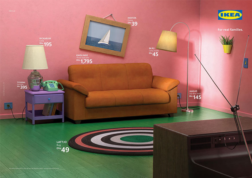
IKEA Recreates the Simpson’s Living Room
Ikea is no stranger to content marketing that is both inexpensive and pop culture savvy. Now, they’ve recreated famous television sets with Ikea furniture. Want the living rooms from The Simpsons, Friends, or Stranger Things? Well, apparently you can. And of course, with the recent season of Stranger Things, this is particularly timely content.
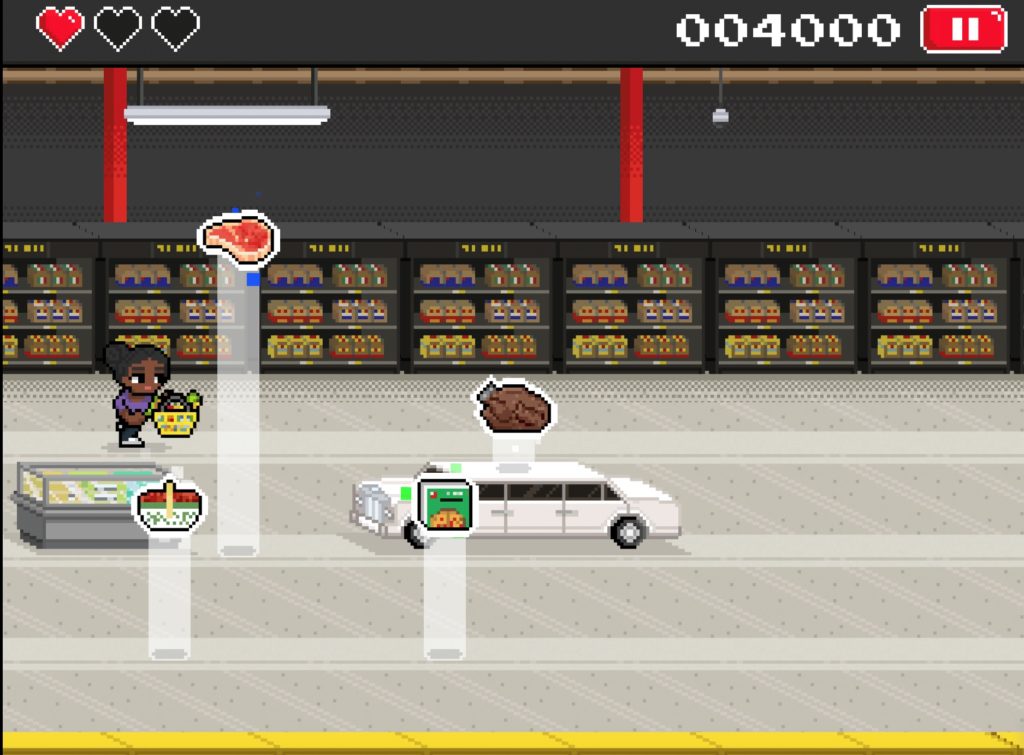
The No Frills Video Game
No Frills, the budget grocery chain, has a video game. Important things to note: one, it’s a free video game. Two, it’s a super easy side-scroller. And three, it can be played in your web browser. You switch lanes, jump, dodge limousines and other ‘frills’, collect items, and you can even translate your score into real-world PC points.
We’re always amazed that more companies don’t do this. Browser games are simple, popular, and make for fun content marketing. The talent to create them is certainly out there, and as this game proves, you really don’t need to reinvent the wheel to make something fun.
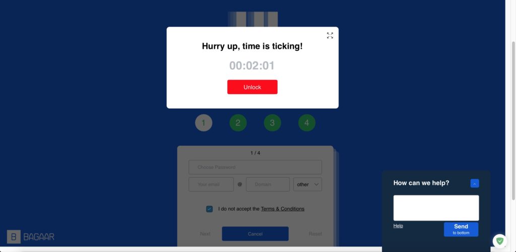
The Most Poorly Designed Webpage Ever
Everyone takes good user interface for granted. And like many things taken for granted, we tend to forget the thought and work that goes into good user interface. Well, go ahead and visit User Inyerface, an intentionally poorly designed webpage by design company Bagaar. On their blog, they write:
“A user assumes certain actions to be in a certain place or color because interface designers worldwide have been collaboratively educating users and feeding them these design-patterns.
But what happens if we poke all good practice with a stick and stir it up? What if we don’t respect our self-created rules and expectations, and do everything the other way around?”
It’s a bit of a neat marketing trick to prove how good you are at your job by showing what a poor job looks like. Maybe that’s why we’re so into this terrible site. We’ve been sending it to every developer we know.